Logo refresh case study
Year: 2018
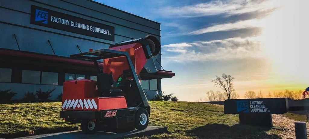
Client: Factory Cleaning Equipment Inc. (now LLC)
Role: Internal Marketing Director
Deliverables: Brand identity redesign & brand messaging

After
Before
Overview
Founded in 1994, Factory Cleaning Equipment (FCE) is one of the largest suppliers of floor sweepers and scrubbers with locations in Illinois and North Carolina. Their internal driving force is to revolutionize the way people clean their floors. Through their growth from selling sweepers out of a minivan to the large scale distributors they are today, their philosophy has always held - be “big enough to serve your needs, small enough to know your name.”
When I joined as their marketing director in 2018, I noticed their logo no longer reflected their massive growth, the driving force behind it, nor their long-held philosophy
I initiated a complete logo modernization that elevated the brand while respecting the legacy of the previous mark.
I rounded out the brand identity with some simple brand messaging to better communicate with their target audience.
Brand discovery
Having been new to the company, every day was not just about learning the operations of the marketing department but looking deep within the brand to find new opportunities for communication with customers. Brand messaging was as important to me as the marketing budget, if not more.
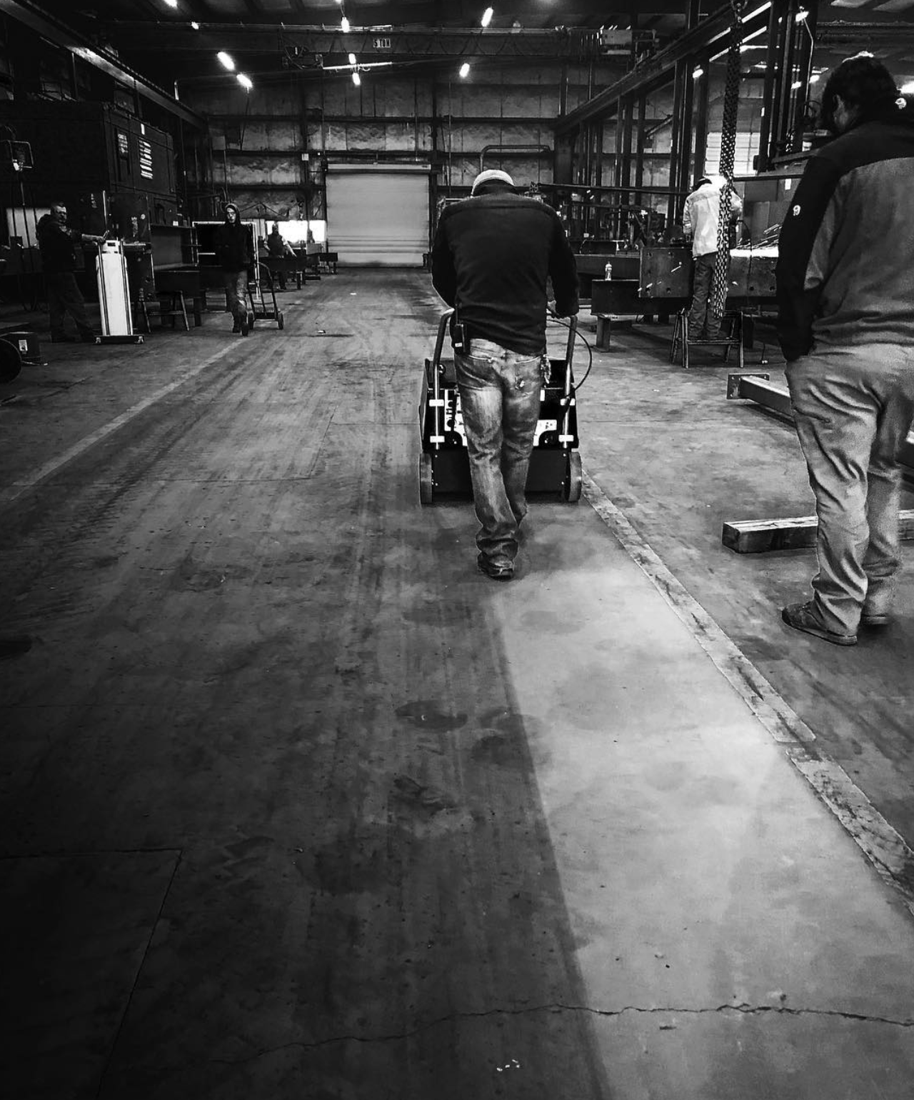
In the early days, I would do a ride-along with the sales team and quickly learned there was cornerstone to their pitch - a facility with a floor so dirty the staff didn’t think it would ever be clean again. The salesperson would salivate at the opportunity to demo the machine, knowing it would put down a clean line behind it, showing the stark contrast between clean and dirty and reveal to the staff a floor they haven’t seen since the day they moved in.
A sales person who failed to demo the machine and draw that line on the floor failed to make a sale.
I recognized this moment during the demo as a shared experience between the sales team and the customer.
The challenge
The original logo had served the company for more than 20 years but had some emerging limitations
It looked dated, not reflecting the company’s growth and scale.
With limited lockups, it needed versatility to work better across platforms.
Extra details and explainer text did not scale well for smaller applications.
It did not communicate a “revolution” within the company that was trying to revolutionize the way their customers clean their floors.
Redesigning a logo used for 20+ years needed to feel like an evolution, not a disruption, to gain approval from leadership.
With the company’s strong history and customer loyalty - my job was to modernize while keeping the integrity of the original design and the show respect for the company’s heritage.